

Premier Land Company represents prospective land buyers and sellers throughout Montana. Their extensive marketing campaigns provide a strong national presence that attract clients from across the United States. Many of these relationships have often spanned generations. Their team of professionals assists in the buying and selling of real estate and their Estate Planning Team provides unique solutions and strategies to help clients retain property for generations to come.
The Challenge
To coincide with a change in company name, Premier Land Company tasked Zee Creative with handling a branding revamp. They needed a new, professional logo, print advertising & collateral, and a sleek, easy-to-use, website that clearly displayed their available services and expertise. The website would primarily be used for new clients interested in learning more about them, rather than for current clients.


PLC needed content that showcased who they were and what the offered, along with their long history of success. They wanted potential customers feeling at ease and having confidence knowing the company has a track record they could trust. This was done through confidence builders like testimonials and integrating a custom video on the website showcasing their values.
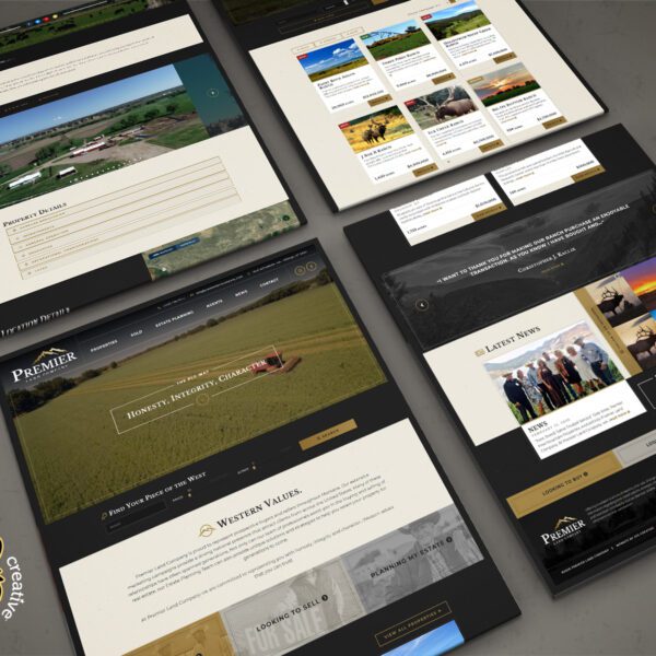
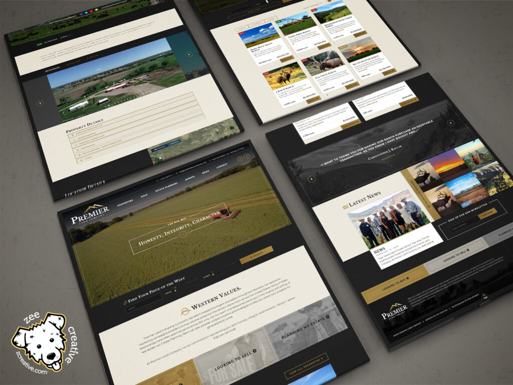
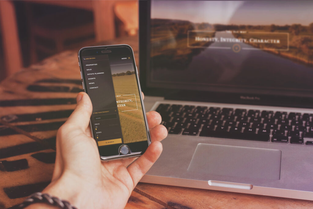
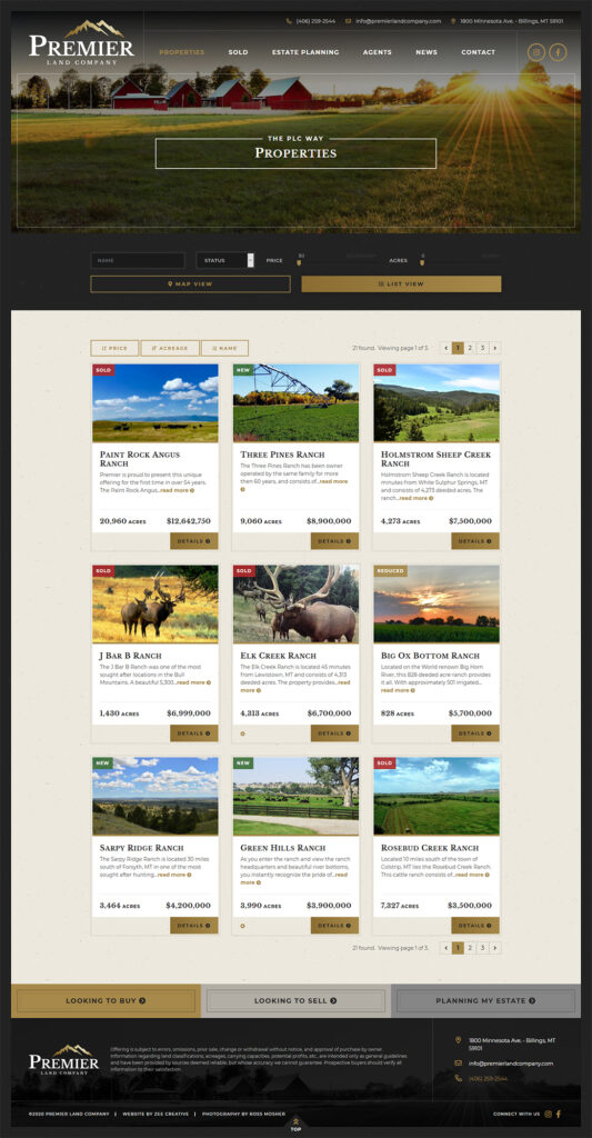
Additionally, the site features an elegant, modern “dark mode” inspired design that makes their strong photography and videos pop. The site makes it easy for users to get the latest and greatest out of Premier Land Company via a social media feed, blog, and newsletter signup. A custom real estate property management solution allows PLC to easily update details through the admin while simultaneously allowing users to quickly find their very own piece of the west, no matter their viewing device.
The Result
Premier Land Company’s branding, website, ad designs, and print materials all came together seamlessly to create a professional & sleek yet inviting home for new and existing clients alike.
The content flows easily in digestible sections, drawing the eye down, and the colors of their logo and the overall project branding lend themselves to professionalism and timelessness without seeming too uptight.
Ultimately, Premier Land Company’s project was about balancing the company’s roots in western values with a fresh look – and it was a huge success!


